Infographic: The U.S. Army from 1960 to Today
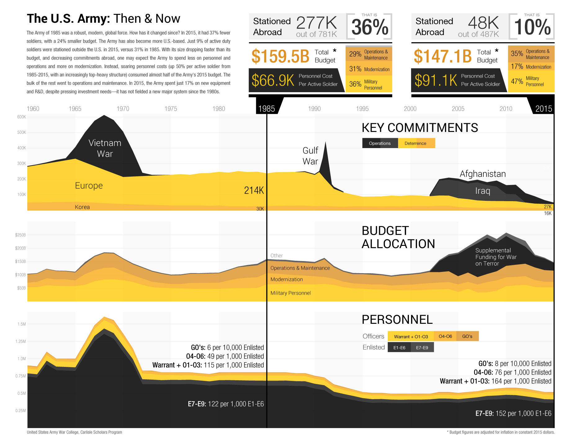
This infographic presents an overview of the U.S. Army since 1960. The graphs (from top to bottom) depict the Army’s major deterrence and operational commitments, total budget and mix of spending (in constant 2015 dollars), and size and personnel structure. Two call-outs provide a more detailed comparison of 1985 and 2015, illustrating changes in the global posture of the force, its spending priorities, the cost of soldiers, and (in the bottom chart) the increasing ratios of officers to enlisted personnel. The Army influences but does not determine the resources and objectives that it is given, but it has more control over how it spends its budget, and how it organizes and postures itself to meet the nation’s needs. What should the Army do to be better prepared for emerging requirements? For some answers, read The Elihu Root Study on the Total Army by the Carlisle Scholars Program.
Infographic Credit: Andrew Hill, U.S. Army War College, and Shayan Kheradmand, Boost Labs.
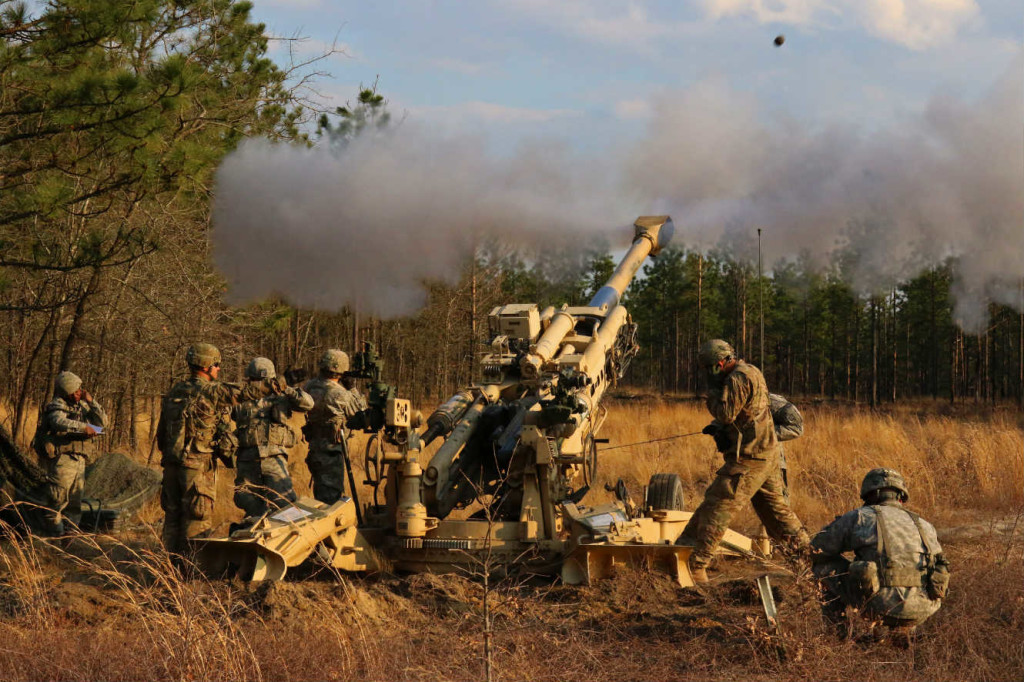
Image: U.S. Army, Captain Joe Bush